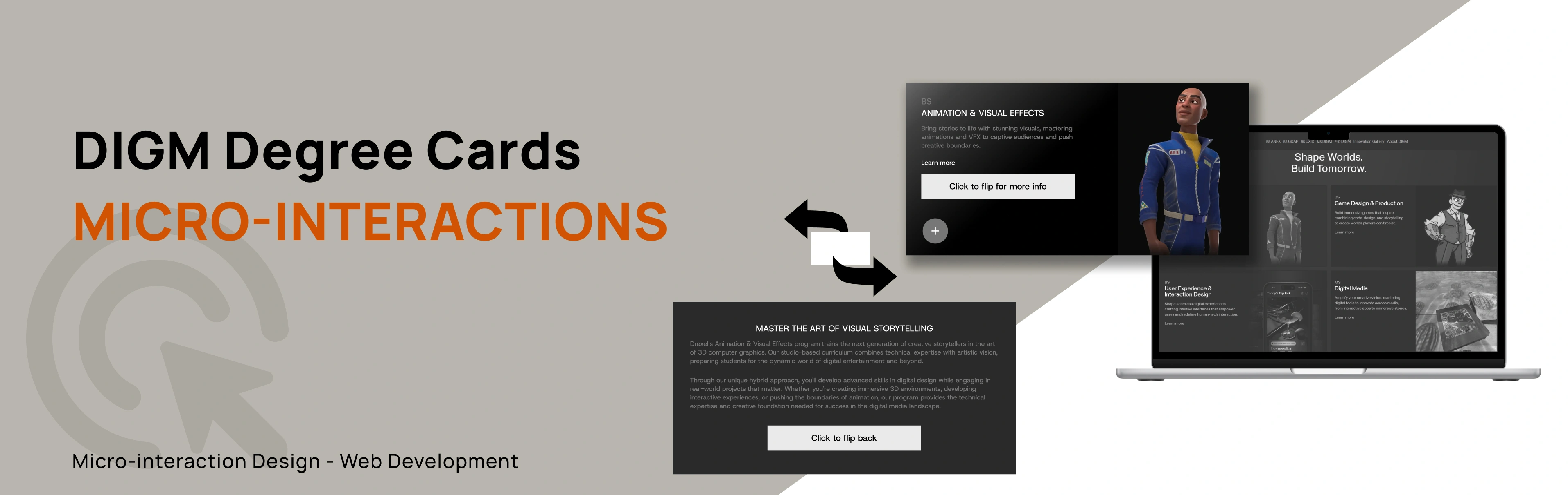
DIGM Degree Card Micro-interactions
Overview
This project explores the end-to-end redesign of microinteractions for the Drexel DIGM degree cards found on the program’s homepage. The original interface contained minimal hover feedback and few interactive affordances that could enhance users’ sense of control and engagement.
Across three development stages of Alpha, Beta, and Final Builds, I designed, documented, and coded progressively more complex microinteractions. Each build was implemented in its own webpage, allowing me to evolve the interaction behaviors.
The final solution introduces a fully interactive card system featuring hover animation, color transitions, menu expansion, a favorite button, sharing animations, and a 3D flip card interaction. These improvements created a richer and more interactive experience.


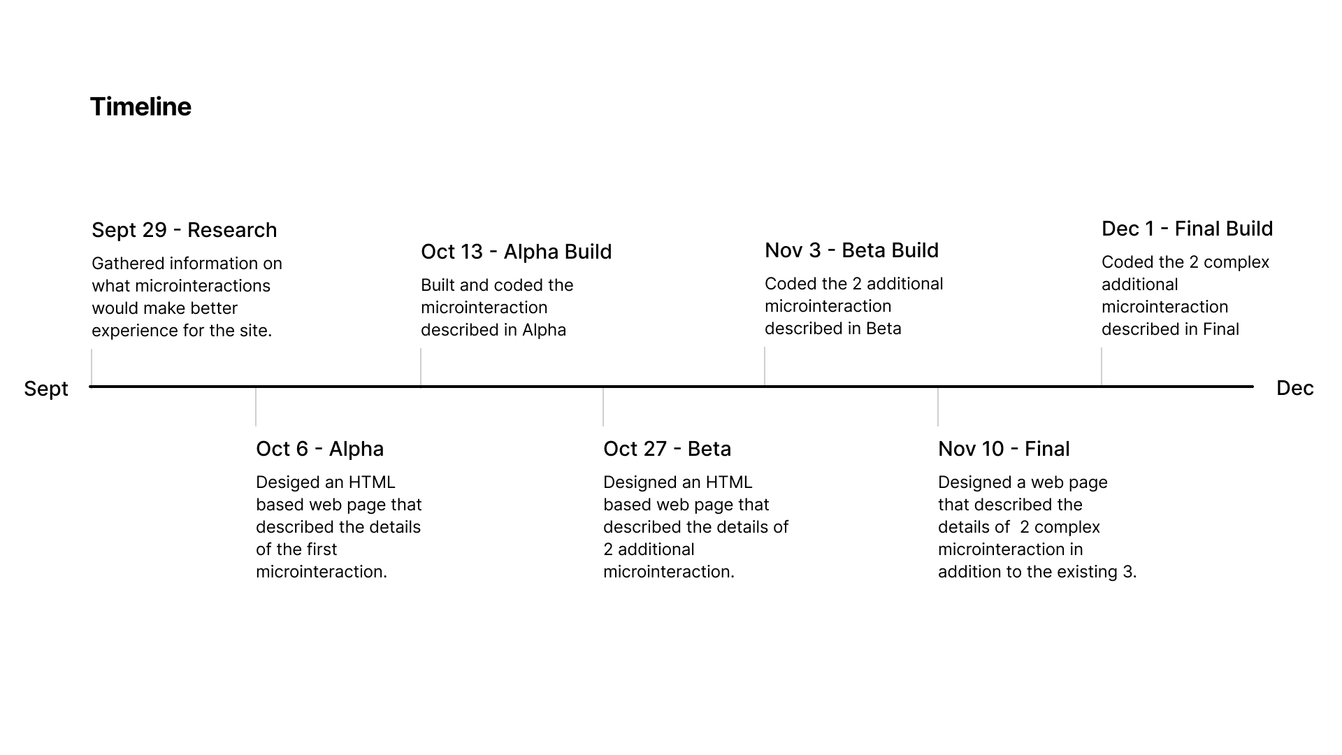
Timeline
Sept 2025 - Dec 2025
Role
Solo Designer & developer
Tools
Figma, HTML, CSS, Javascript
Context and Challenge
Background
For this Project, I had to examine the degree-cards area on Drexel's DIGM website and iterate a set of microinteractions. The project required designing and coding three levels of the microinteractions, each documented separately and built in standalone webpages. These were Alpha, Beta, and Final with each one having its own build. The purpose was to improve the existing interface by enhancing meaningful interactions that reinforce user control, readability, and delight.
Timeline breakdown
September 2025 - December 2025 (4 months)
The Problem
The existing page worked, but the interactions felt flat and unresponsive. There were not enough visual cues to guide users or acknowledge their actions, which made the experience feel less engaging. I saw this as an opportunity to add microinteractions, small moments of feedback that help users feel more connected and engaged as they navigate the page.
Goals
1
Improve clarity and responsiveness of the degree cards
2
Build fully functional prototypes in HTML/CSS/JS
3
Document triggers, rules, feedback, and loops/modes for each build stage
4
Add opportunities for user control (favorites, sharing, etc.)
5
Create microinteractions that enhance the UX without overwhelming users
Design Process and Insight
Research
To understand where microinteractions could make the biggest impact, I reviewed the existing page and observed how users would interacted with its main features. I paid attention to moments where there might be hesitations or repeated actions. These small points of friction highlighted where feedback was missing.
I also looked at common patterns from similar interfaces to see how they used motion, hover states, and visual cues to guide users. This helped me identify opportunities to create a more responsive experience. Overall, the research confirmed that adding purposeful microinteractions would help the page feel smoother and more engaging.
Alpha
The goal was to identify one simple microinteraction from the the website and analyze so i chose Hover. The description included the trigger and rules. Rules and feedback ended up the same because the microinteraction does not update or write any state to the database and there is no loop or mode.
Below is the description for the microinteraction;
Trigger:Hover on and off
Feedback:
The image switches from grayscale to full color when hovered
The image also zooms in slightly when hovered
The card background color changes to gradient when hovered
transitional time is 0.5s ease in and out
Alpha Build
HTML based webpage: Alpha Build
This is where i built and coded the Hover microinteraction that was described in Alpha usng HTML and CSS.
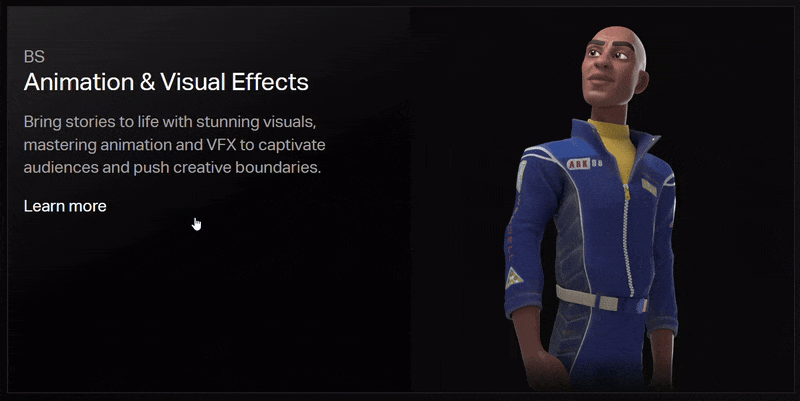
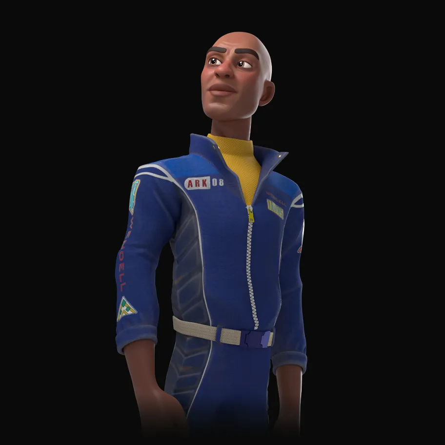
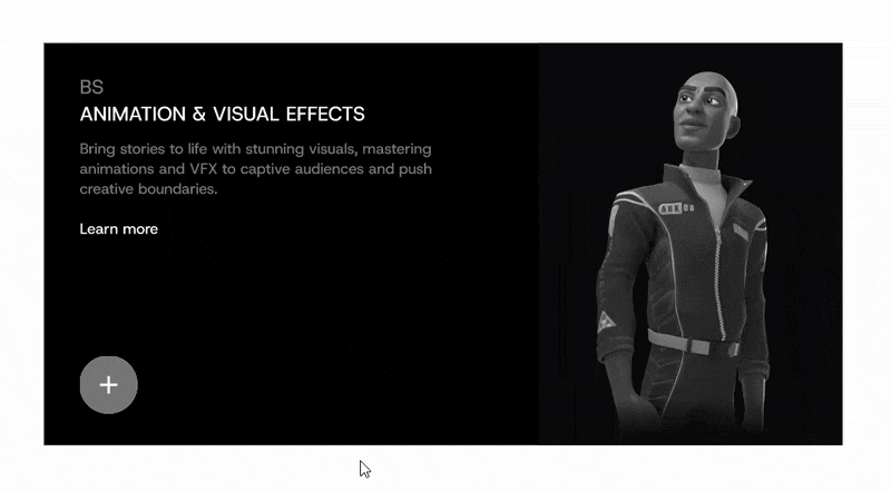
BS
Animation & Visual Effects
Bring stories to life with stunning visuals, mastering animations and VFX to captive audiences and push creative boundaries.
Learn more
Beta
In the Beta stage, I took what worked from the Alpha version and added 2 more microinteractions. The interactions i added was a "+" or "more" button and a "Favorite" button with triggers with a click. I tested different timings, easing styles, and feedback patterns to see which options supported the user experience best.
I started by making a prototype on figma on how the new microinteraction would work the the one in alpha. Below is a gif of the beta idea design on figma.
These are the description for the additional microinteractions;
Trigger:Click
Feedback:
"+" button
"+" icon rotates 135 degree to make an "x" icon
menu bar slides open to the right
"x" icon rotates back to make a "+" icon
menu bar slides to close
transitional time is 0.5s ease in and out
"Favorite" button
button gets filled in black
state of button gets updated in the database until clicked again
transitional time is 0.5s ease in and out
Beta Build
HTML based webpage: Beta Build
In the Beta Build, I coded a different HTML based webpage and added JavaScript since i had some microinteractions that triggers by clicking.
Below is the embedded build
BS
Animation & Visual Effects
Bring stories to life with stunning visuals, mastering animations and VFX to captive audiences and push creative boundaries.
Learn more
Final
In the final stage, I designed 3 additional microinteraction designs to the 3 that already existed in Alpha and Beta. These were; one hover trigger and two click-triggered actions. Each interaction was carefully prototyped in Figma to test timing, motion, and usability before being finalized and coded.
These are the description for the additional microinteractions;
Trigger:
Share button Click
Flip button Hover
Flip button Click
Feedback:
Share button Click
brief “fly out” send motion for the icon to convey action.
transitional time is 0.5s ease in and out
Flip button
Hover fills flip icon left to right
Click flips card horizontally to show the back;
click executes flip animation.
transitional time is 0.5s ease in and out
Final Build
HTML based webpage: Final Build
All 6 microinteractions were coded on a separate HTML based webpage with all 6 microinteractions functional.
BS
Animation & Visual Effects
Bring stories to life with stunning visuals, mastering animations and VFX to captive audiences and push creative boundaries.
Learn more
Click to flip for more info
MASTER THE ART OF VISUAL STORYTELLING
Drexel's Animation & Visual Effects program trains the next generation of creative storytellers in the art of 3D computer graphics. Our studio-based curriculum combines technical expertise with artistic vision, preparing students for the dynamic world of digital entertainment and beyond.
Through our unique hybrid approach, you'll develop advanced skills in digital design while engaging in real-world projects that matter. Whether you're creating immersive 3D environments, developing interactive experiences, or pushing the boundaries of animation, our program provides the technical expertise and creative foundation needed for success in the digital media landscape.
Click to flip for more info
Results
The DIGM Microinteractions project successfully demonstrated how purposeful motion and feedback can transform a flat interface into an engaging, responsive experience across three iterative builds.
Key outcomes:
Delivered 6 fully functional microinteractions across Alpha, Beta, and Final builds
Each build was documented with trigger, rule, feedback, and loop/mode descriptions
The final card system features hover, 3D flip, expand menu, favorite, share, and color transition interactions
Interactions were validated through iterative prototyping in Figma before coding
The project reinforced how small design decisions compound into a meaningfully better user experience
Overall, the project met its goal of enhancing the DIGM degree cards with interactions that feel intuitive, responsive, and delightful.


